Airline Dashboard
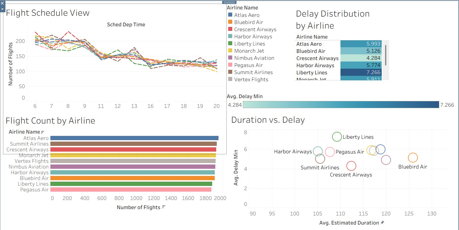
This airline performance dashboard visualizes flight schedule data across ten fictional carriers, displaying departure time trends, total flight counts per airline, and average delay distributions using a combination of line charts, bar charts, and a scatter plot. The delay distribution chart and Duration vs. Delay scatter plot reveal that Liberty Lines consistently experiences the highest average delays while Crescent Airways maintains the lowest, providing actionable insight into carrier performance differences.
Global Shipment Performance Dashboard
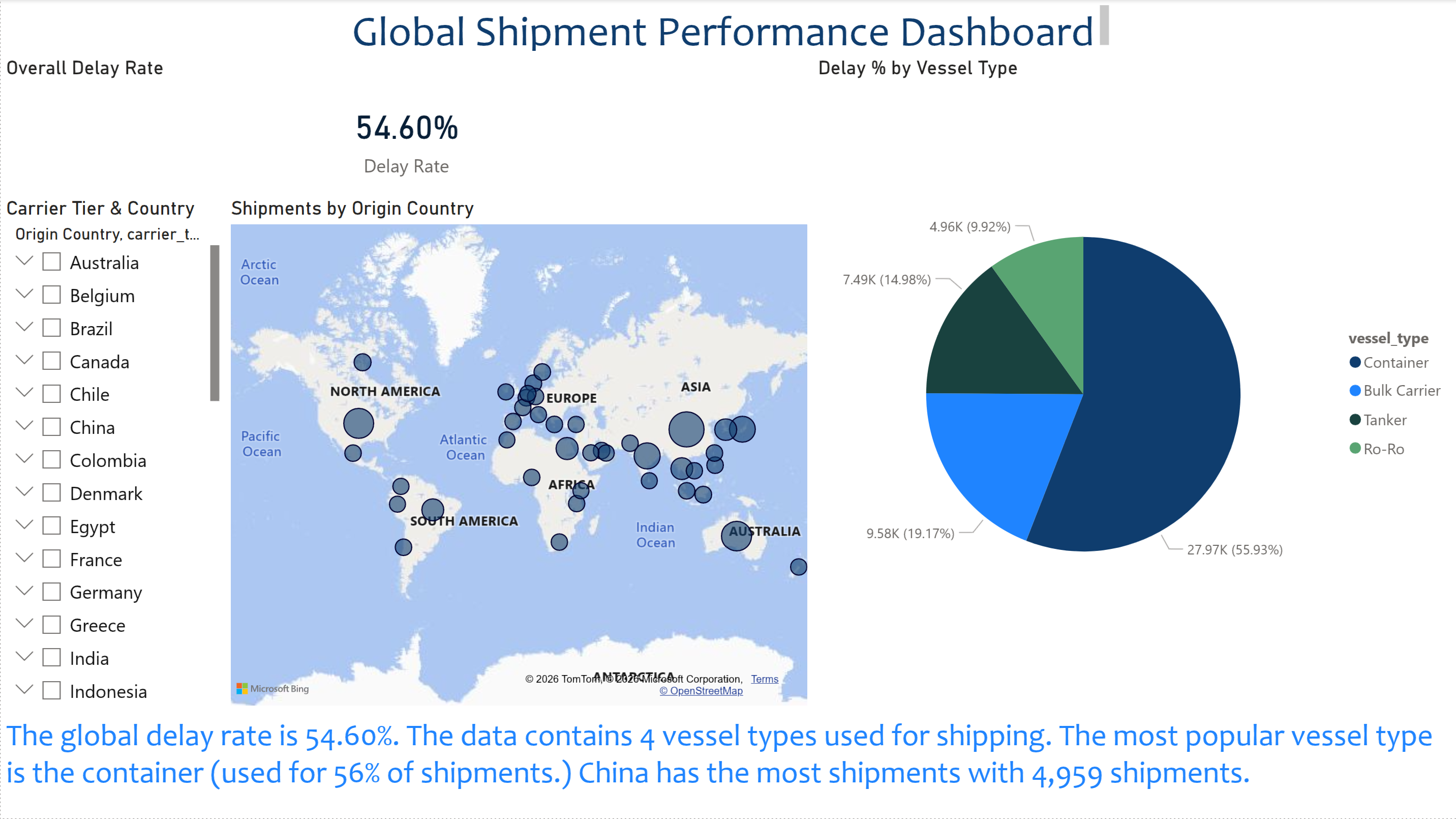
This global shipment performance dashboard tracks an overall delay rate of 54.60% across international shipping routes, visualized through an interactive world map showing shipment origins by country and a pie chart breaking down vessel type usage. Container ships account for the majority of shipments at nearly 56%, with China identified as the highest volume origin country across the dataset.
Sales Report Dashboard
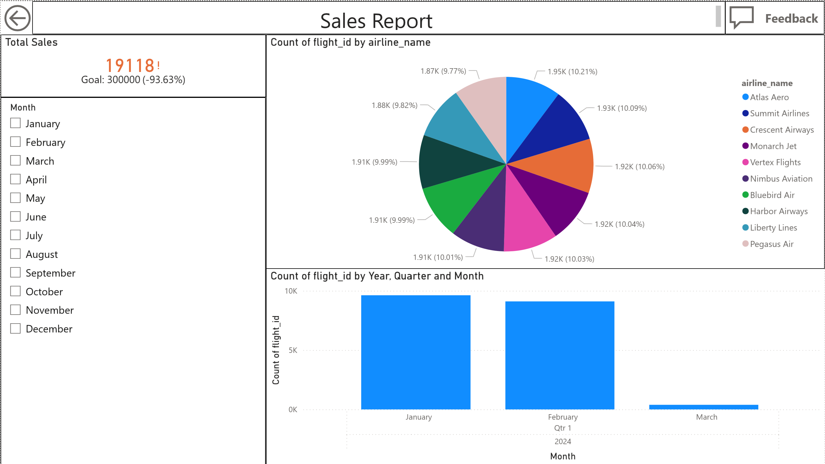
This sales report dashboard tracks total flight sales against a goal of 300,000, currently sitting at 19,118 which represents a 93.63% gap to target. A pie chart breaks down flight counts evenly across ten airlines showing roughly 10% share each, while a quarterly bar chart reveals that flight activity drops significantly after January and February of Q1 2024.